Case study 01 · 2015–16
NowThis
Designing news for a phone held upright, with the sound off.
- Role
- Senior Product Designer, contract
- When
- Sep 2015 – May 2016
- Where
- New York
- Scope
- Video formats · playlist system · brand · app R&D

01 — The problem
The audience had moved to the phone. The sound was off.
NowThis made news for social platforms, not for television. By 2015 most of its audience watched on a phone, in a feed, usually without sound, and decided in a second or two whether to keep watching.
Video built for a TV screen failed there. The story had to land fast, read without audio, and fit how people actually hold a phone. The team needed a design system for that, not a one-off edit.
02 — One story, three shapes
Every story existed in three cuts.
Vertical for phones, square for feeds, wide for desktop and players. I worked on the layout system for those cuts: where text sits, how big it is, how captions and overlays carry a story that nobody is listening to.
03 — The playlist system
A 20-minute interview became eight stories.
When NowThis interviewed Vice President Joe Biden, a single 20-minute video would have lost most of its audience in the first minute. We cut it into eight short clips, each one able to stand alone and be shared on its own, but sequenced so they could also be watched in order.
That playlist pattern let people choose their own depth: one clip, or the whole conversation. It is close to how stories work on every platform today.

04 — Six rules we designed by
Written from real audience data, still true today.
- 01
Skip the intro.
Get to the story immediately. Every second of setup is a second someone scrolls away.
- 02
Land it in seconds.
In an endless feed the point has to arrive before the thumb moves.
- 03
Design for silence.
Text overlays mean anyone can follow, with or without sound.
- 04
Only essential audio.
When sound is on, use only what the story needs.
- 05
Guide the eye.
Scale, emphasis and motion as directing tools, used with restraint.
- 06
Vertical first.
Not a rotated landscape frame. Bigger text, tighter framing, thumb-friendly.
05 — App research
Share once. The right cut arrives.
I also worked on research for a gesture-based NowThis news app. One idea was smart sharing: when you share a story, the app detects where it is going and sends the right format, vertical to a phone, wide to a desktop, so nobody has to choose.
The app itself never shipped. The research did its job: it tested one-thumb navigation, offline viewing and format routing with real prototypes, and those ideas fed the team's thinking.
06 — Cross-platform brand
One mark, every channel.
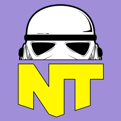
NowThis ran many channels across Snapchat, Instagram, Facebook and YouTube, and the avatars had drifted apart. The rebrand gave every channel the same bold NT mark with one colour and one label each, so a channel is recognisable at scroll speed and the family still reads as one brand.
Before

After




07 — What I bring from this
- Design for the real context. Phone, feed, sound off. Not the ideal one in the meeting room.
- Systems over one-offs. Rules a whole newsroom can apply every day beat a perfect single edit.
- Prototype to learn. An app that never shipped still answered the questions it was built to ask.